PATTERNS IN INVENTORY
It has been a tenet of our Mammoth Lakes real estate market that inventory (number of condos and homes for sale) in Mammoth Lakes increases in late spring and decreases in the fall.
Increase in Spring: Inventory increases after winter because (1) owners of condo rental units do not make as much income in the spring/summer/fall as they do in winter, so if they want to sell, they figure they will do it when rental income slows down, and (2) single family homes tend to show better in the summer (and you can actually inspect the grounds and landscaping now that they are not underneath snow).
Decrease in Fall: Inventory then declines in the fall when (1) rental owners who have been unable to sell decide to take their units off the market and rent for another winter, and (2) there is usually a mini buying spree around Labor Day as buyers decide to stop renting and want to spend Thanksgiving in their new vacation place.
This pattern had not been steady during the wild market upswing of 2003-2006 nor the downswing in 2007-2010, probably because larger market forces (easy money during the ‘bubble’ and the subsequent sobering burst of the bubble) were overriding this seasonal pattern. But from 2010 – 2015, the spike and valleys of our inventory has read like the heartbeats of an EKG (see graph).
The graph plots number of properties for sale, the average Days on Market (DOM), and the difference between the two. When a bunch of properties come on the market at the same time, the overall average DOM (the blue line) goes down. And then, when they sit for a long time, the DOM starts creeping back up. A rapid succession of new listings (inventory…the green line) show up as a spike on the graph when one calculates the difference between inventory and average DOM (“Difference” is the maroon line). When the difference is high, it can depict “lots of fresh listings.” When the difference is low, it usually means “few, stale listings”
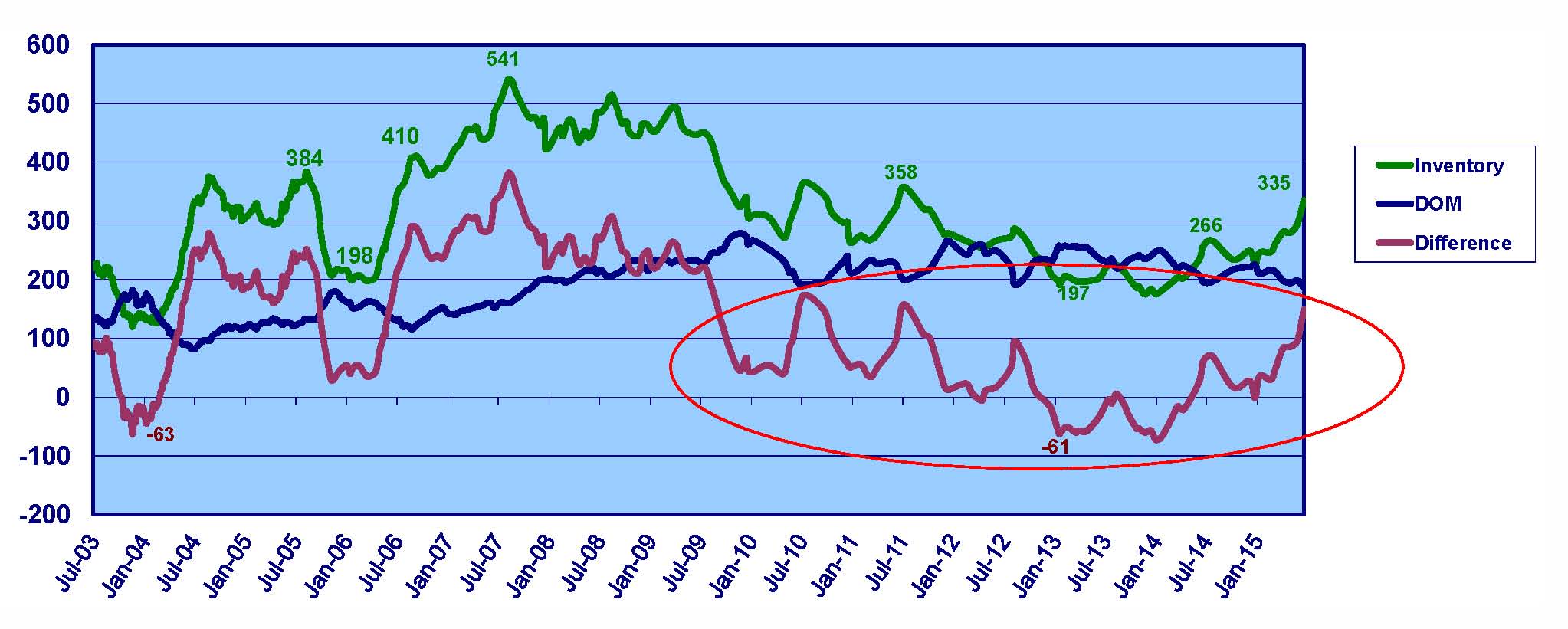
Inventory Indicator Graph
Since 2010, we see regular spikes of the maroon line occurring in late July – early August. This is when sellers decide to sell and maximize their listing exposure during the nice weather and greenest grass times of summer. Inventory is at its highest and freshest (lowest days on market). As a buyer, this is when you have the most choices. As a seller, this is when you have the most competition!
Troughs tend to occur between January and April of each year. This is when buyers are done buying properties for the ski season and inventory gets depleted. It is also when sellers, who are thinking of selling, wait until the ‘shoulder season’ ends so that their property is fresh when the summer buyers come around the 4th of July.
It is interesting to see how steep the graph is on either side of the peaks. On the front side, there is almost a mad rush to get properties listed for sale before the crowds of summer start visiting Mammoth. On the back side, the buying spree in fall, combined with sellers letting their listings expire at the end of summer create a steep drop in the maroon line when inventory decreases and DOM increases.
Can’t time the market? We are told that it is almost impossible to ‘time the market’ (i.e. buy low and sell high). Well, you might be able to “time the inventory” and buy in the spring when choices are plentiful and sell in the fall when buyers are a little more motivated.


